


.svg)


Most data warehouses don’t break overnight. They start showing small inconsistencies that are easy to ignore.
- A dashboard takes longer to load.
- Two reports show slightly different numbers.
Teams begin to question the data, but no one can clearly explain why.
At first, it feels like a tooling issue. In most cases, it is not.
The problem usually starts with how fact tables and dimension tables were designed.
These are not just modeling concepts. They directly shape how your data behaves when decisions depend on it.
So what is the real difference between fact tables and dimension tables, and why does it matter more as your data grows?
What Is a Fact Table and a Dimension Table
A fact table stores numerical data used for analysis, such as sales, revenue, or transactions. It defines what your business measures.
A dimension table stores descriptive data that adds context, such as customer details, product categories, or dates. It defines how those metrics are interpreted.
You need both.
Without fact tables, there is nothing to measure.
Without dimension tables, there is no way to interpret what those numbers mean.
This separation is what allows data systems to scale without becoming inconsistent or confusing.
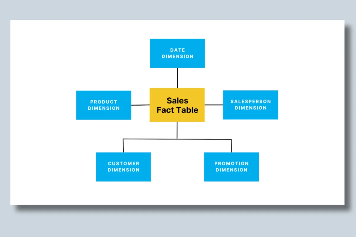
Image Source: Fact vs. Dimension Tables Explained
Key Differences Between Fact Table and Dimension Table
Fact and dimension tables serve distinct but complementary purposes in a data warehouse. Each contributes to the efficiency and clarity of data analysis.
Fact tables focus on capturing quantitative metrics, while dimension tables provide descriptive attributes needed to interpret those metrics.
The following table highlights the primary distinction between these two components, offering a clearer understanding of their roles:
How Fact and Dimension Tables Work Together
In most data warehouses, fact and dimension tables are connected through a star schema.
- The fact table sits at the center
- Dimension tables connect to it using keys
At query time, every analysis depends on joining these tables.
For example:
- A fact table stores sales transactions
- A customer dimension adds who made the purchase
- A product dimension adds what was purchased
- A time dimension adds when it happened
Every dashboard query essentially combines these pieces.
Why this matters:
If dimensions are inconsistent or poorly structured:
- joins become expensive
- queries slow down
- results differ across dashboards
This is where many data issues begin. Not in the data itself, but in how it is connected.
Types of Fact Tables and Dimension Tables
Types of Fact Tables (What You Choose Matters)
The type of fact table you choose directly impacts performance, flexibility, and query behavior.
1. Transactional Fact Table
Stores every event at the lowest level of detail.
Example: Every individual sale in an e-commerce system.
When to use:
- When you need granular insights such as user behavior or transactions
What happens at scale:
- These tables grow very large
- Queries become slower without partitioning or optimization
2. Snapshot Fact Table
Stores data at specific intervals instead of capturing every event.
Example: Daily inventory levels or monthly account balances.
When to use:
- When you care about trends over time rather than individual events
Tradeoff:
- Faster queries and smaller data size
- Less detail for deep analysis
3. Accumulating Fact Table
Tracks a process as it moves through stages.
Example: Order lifecycle from placed → shipped → delivered.
When to use:
- When analyzing workflows or process efficiency
Complexity:
- Requires updates over time
- Can introduce inconsistencies if not managed carefully
Types of Dimension Tables (Context That Scales)
Dimension tables determine how flexible and consistent your reporting becomes.
1. Conformed Dimension
A shared dimension used across multiple fact tables.
Example: A single “Date” dimension used across sales, inventory, and marketing.
Why it matters:
Without conformed dimensions, different teams define metrics differently, leading to inconsistent reporting.
2. Slowly Changing Dimension (SCD)
Tracks changes in attributes over time.
Example: A customer’s address history.
Why it matters:
Without SCDs, you lose historical context. Reports reflect only current values, not how data evolved.
3. Role-Playing Dimension
The same dimension is used in different contexts.
Example: A date dimension used as order date, shipping date, and delivery date.
Why it matters:
Prevents duplication while enabling multiple analytical perspectives.
Common Mistakes Teams Make
Most data warehouse issues do not come from tools. They come from early design decisions.
1. Mixing descriptive data into fact tables: Leads to duplication and larger tables, making queries slower.
2. Overloading dimension tables: Adds unnecessary complexity and makes filtering inefficient.
3. Not defining clear granularity: Creates confusion when aggregating data across reports.
4. Ignoring performance early: Works initially, but breaks as data volume and usage increase.
Why this is dangerous:
These issues do not show up immediately. They appear when:
- more teams start using the data
- queries become heavier
- inconsistencies begin to surface
By then, fixing them requires significant rework.
How to Know If Your Tables Are Designed Correctly
Most data modeling issues do not show up during design. They show up when teams start depending on the data.
Instead of looking for technical errors, it helps to watch for patterns in how your data behaves.
1. Dashboards take longer to load
When dashboards that once loaded quickly start slowing down, it is often a sign that fact tables are growing without proper optimization.
What this usually indicates:
- excessive joins between fact and dimension tables
- lack of pre-aggregation
- poorly defined granularity
Over time, this turns into a performance issue that affects every downstream user.
2. Teams ask “which report is correct”
This is one of the clearest signals of a modeling issue.
When different dashboards show different numbers for the same metric, it usually means:
- dimension definitions are inconsistent
- joins between tables are not aligned
- business logic is not standardized
At this stage, the issue is no longer technical. It becomes a trust problem.
3. Metrics differ across dashboards
Even small inconsistencies in metrics can indicate deeper structural gaps.
What is happening underneath:
- the same data is being interpreted differently
- multiple versions of dimensions exist
- aggregations are applied inconsistently
As more teams rely on the data, these differences become harder to reconcile.
4. Data is duplicated across systems
Duplication is often a symptom of weak relationships between tables.
This typically points to:
- missing or incorrect foreign key relationships
- lack of conformed dimensions
- inconsistent identifiers across systems
The result is inflated metrics, incorrect reporting, and confusion across teams.
5. Fixing issues takes longer than expected
When simple issues take hours or days to resolve, it usually means the model lacks clarity.
What this reveals:
- poor data lineage visibility
- tightly coupled tables that are hard to debug
- unclear ownership of data definitions
This is where operational inefficiency starts to grow.
What this means in practice
These signals rarely appear in isolation. They tend to show up together as systems scale.
What starts as:
- a slightly slower query
- a small mismatch in reports
gradually becomes:
- unreliable dashboards
- duplicated data
- increased effort to validate every insight
At that point, the issue is not tooling or pipelines. It is structural.
And that structure is defined by how fact and dimension tables were designed.
Best Practices for Better Data Modeling
Reliable data systems are rarely the result of complex designs. They come from a few decisions made carefully and applied consistently.
1. Define clear granularity in fact tables
Granularity defines what a single row in your fact table represents.
If this is unclear, everything downstream becomes harder:
- queries return inconsistent results
- aggregations behave unpredictably
- teams interpret the same metric differently
For example, if one table stores “daily sales” and another stores “transaction-level sales,” combining them creates confusion unless the level of detail is clearly defined.
Getting granularity right early prevents rework later.
2. Use surrogate keys in dimension tables
Surrogate keys act as stable identifiers that are independent of business logic.
Why this matters:
- natural keys like email or product name can change
- updates can break joins across systems
- historical tracking becomes unreliable
Surrogate keys ensure relationships remain consistent even as underlying data evolves.
3. Keep dimension tables simple and focused
Dimension tables are meant to provide context, not complexity.
When too many attributes are added:
- queries become heavier
- dashboards slow down
- users struggle to find the right fields
A focused dimension table makes it easier to:
- filter data
- group metrics
- build consistent reports across teams
Simplicity here directly improves usability.
4. Pre-aggregate data where performance matters
Not every query needs raw-level detail.
As data grows:
- querying transaction-level data becomes slower
- dashboards take longer to load
- users experience delays in analysis
Pre-aggregating common metrics (like daily totals or monthly summaries) helps:
- reduce query load
- improve performance
- make dashboards more responsive
This is especially important for high-traffic BI environments.
5. Continuously review query patterns
Data models are not static. They need to evolve with how teams use data.
Over time:
- new queries are introduced
- usage patterns change
- performance bottlenecks emerge
Regularly reviewing query patterns helps you:
- identify slow queries early
- optimize joins and indexes
- refine table design based on real usage
Without this, even well-designed models degrade over time.
What this means in practice
Good data modeling is not about adding more layers or making systems more sophisticated.
It is about ensuring that:
- data is easy to query
- metrics are consistent across teams
- systems perform reliably as usage grows
When these principles are applied well, teams spend less time fixing data and more time using it.
How Fact Tables and Dimension Tables Work Together
How Fact and Dimension Tables Power BI
Most dashboards do not fail because of visualization tools. They fail because the underlying data model is not structured properly.
Fact and dimension tables are what make BI tools like Power BI and Tableau usable at scale.
At a basic level:
- fact tables store the metrics such as revenue, transactions, or counts
- dimension tables provide the context such as customer, product, or time
This separation is what allows BI tools to behave intuitively.
What this enables in practice
When your model is structured correctly, users can:
- filter data without breaking queries
- drill down from summary to detail seamlessly
- analyze trends across multiple dimensions without writing complex logic
For example, a sales dashboard works because:
- the fact table stores total revenue and transactions
- the product, region, and time dimensions allow users to slice that data instantly
A business user can go from:
“total revenue this quarter” to
“revenue by product in a specific region last month”
without needing to understand the underlying query.
What happens when the structure is weak
When fact and dimension tables are not modeled correctly, the experience changes quickly.
You start to see:
- slower queries due to inefficient joins
- dashboards that take longer to load as data grows
- inconsistent metrics across reports due to poor relationships
More importantly: Users stop trusting what they see.
At that point, teams begin validating data manually instead of using it confidently. The problem shifts from usability to credibility.
Making Fact and Dimension Tables Work at Scale
Designing tables is only the first step. Most problems appear later, when systems begin to scale.
As usage grows:
- data volume increases
- pipelines become more complex
- more teams depend on the same datasets
This is when small design issues become visible.
How issues show up over time
What starts as minor inefficiencies gradually becomes:
- inconsistent data across dashboards
- delays in pipeline execution
- slower query performance under load
These are not isolated problems. They are signals that the system is under strain.
Why visibility becomes the real challenge
At this stage, the problem is no longer about storing or querying data.
It is about understanding what is happening across the system.
Most teams do not struggle because they lack tools.
They struggle because they cannot see:
- where data is breaking
- which transformations are failing
- why performance is degrading
Without visibility, teams are forced to react after issues impact reports or decisions.
What changes with better visibility
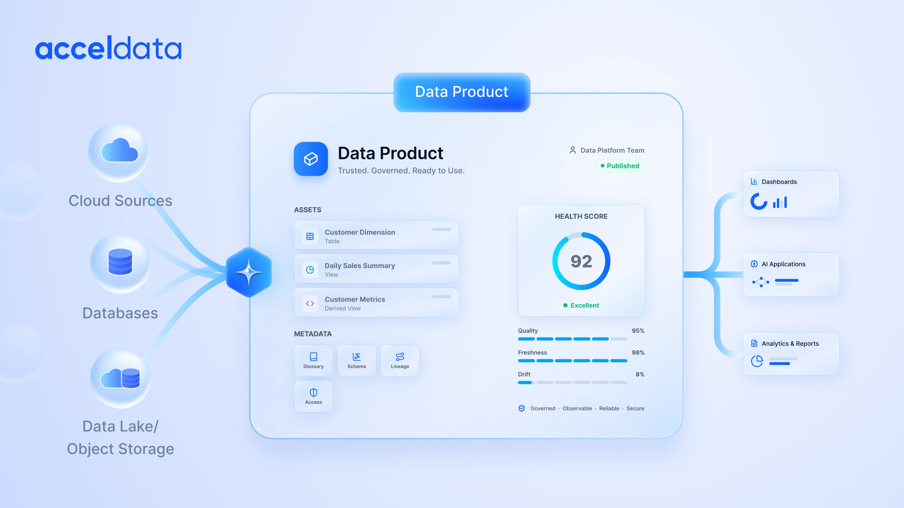
Platforms like Acceldata address this gap by giving teams a clear view of how data behaves across pipelines.
This includes:
- tracking how data moves from source to dashboard
- identifying inconsistencies before they affect reports
- monitoring query performance continuously
This allows teams to:
- detect issues earlier
- reduce downtime
- maintain consistent data across systems
What this means in practice
As systems scale, the challenge shifts.
It is no longer just about building dashboards or storing data correctly.
It is about ensuring that the data remains reliable under real-world usage.
The shift is subtle but important:
From storing data to knowing when that data can be trusted
Key Takeaways
- Fact tables store measurable data used for analysis
- Dimension tables provide context that makes data usable
- Every query depends on how these tables are connected
- Poor design leads to slow queries and inconsistent reporting
- Reliable analytics depends on both structure and visibility
Conclusion and FAQs
Optimizing Fact Table and Dimension Table with Acceldata
Understanding the difference between fact tables vs dimension tables is critical for effective data modeling and designing a scalable star schema. You can ensure efficient data management and unlock the full potential of your BI applications by understanding the roles of these tables and optimizing their design.
By optimizing these components and leveraging Acceldata's tools, you can streamline operations and ensure performance with a focus on data observability, governance, and quality.
- Enhancing data observability
Acceldata provides end-to-end AI-driven data observability tools that monitor data pipelines, identifying bottlenecks and anomalies in your fact tables and dimension tables. With these insights, businesses can ensure seamless querying and reporting.
- Ensuring data governance
Maintaining compliance across your data warehouse is critical. Acceldata’s AI-driven data governance framework ensures your tables adhere to organizational and regulatory standards. This helps in maintaining consistency and integrity across dimension tables while supporting fact table updates.
- Improving data quality
Data quality is key to ensuring accurate analysis. Acceldata automates validation processes to ensure data in fact tables (e.g., sales or transactions) and dimension tables (e.g., product categories or customer demographics) are accurate, consistent, and actionable.
- Performance optimization
Acceldata supports performance tuning by monitoring table size, indexing strategies, and query performance. This is particularly valuable for managing large-scale fact tables and improving access to granular measures and attributes in dimension tables.
- Seamless integration with BI tools
Acceldata’s monitoring tools integrate seamlessly with platforms such as Power BI, Tableau, and Snowflake, optimizing the performance of star schema designs. This allows organizations to extract real-time insights efficiently.
Contact Acceldata today to learn more about how the company can enhance its data management strategy through its AI-driven data observability solution.
Frequently Asked Questions (FAQs)
1. What is the difference between a fact table and a dimension table?
A fact table stores numerical data such as sales or transactions, while a dimension table provides context like customer, product, or time. Together, they enable meaningful analysis.
2. Why are fact and dimension tables important in a data warehouse?
They separate metrics from descriptive context, which improves query performance and ensures consistent reporting across teams.
3. What are the different types of fact tables?
Transactional, snapshot, and accumulating fact tables are the most common. Each serves a different analytical purpose based on detail and time.
4. How do dimension tables improve BI dashboards?
They allow filtering, grouping, and drill-down analysis, making dashboards easier to use and interpret.
5. What is a star schema?
A star schema connects a central fact table to multiple dimension tables, simplifying queries and improving performance.
6. When should you use a fact table vs a dimension table?
Use fact tables for measurable data like transactions. Use dimension tables for descriptive context such as customer or product.
7. Why do data warehouse queries slow down over time?
Due to poor table design, inefficient joins, lack of indexing, and increasing data volume.
8. Why do dashboards show different numbers for the same metric?
Usually due to inconsistent dimension definitions or incorrect joins between fact and dimension tables.
9. How do fact and dimension tables affect performance?
Well-designed tables reduce query complexity and improve speed. Poor design increases joins and slows down analysis.
10. How does data observability help?
It helps detect inconsistencies, monitor pipelines, and identify modeling issues before they impact decisions.